Industry terms:
- Vector – Artwork that is made from points, lines, shapes etc (not pixels) / see more.
- Synonyms: Line art, Mechanical art
- Raster – Raster art is the opposite of vector. It is art made from pixels. Pixels are what make up the representation of your final product. Tiny squares of different colors put next to each other to make a larger graphic. Also known as a “flat” file or bitmap graphic.
- Resolution – Pixels that are in a square inch. Also known as DPI (dots per inch). For good quality results make sure your files (if they are raster) are 300 dpi. Typically images pulled off the internet are 72 dpi thus are not high enough quality to print well.
- Camera Ready – Artwork that is ready to go to press. Correct size, colors, format etc.
- Pantone Colors – (Pantone Matching System – PMS) A standardized list of colors. Subjective ways of calling colors (i.e. “Navy Blue”) are not a great way to describe a color that you would like, your final product may not look the way you want; be more specific.
- Example: PMS 286C is a pretty standard blue color. The “C” stands for “coated” material that the color will be printed on. Material affects the way colors print.
- Imprint – The amount of colors that will be printed. Each color is printed separately. See Screens
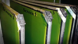
- Screens / Plates – Each color of each design printed has its own silk screen or plate (depending on product)
-
- Example: a 2 color 2 sided sign with arrows pointing the same way is actually 3 screens. 1 screen for each color and 1 screen for the opposite side that has the arrow flipped.
- Galvanized Spring Steel – The galvanized coating prevents the wire stands from rusting. Spring steel means they are made from a low alloy, high carbon steel with very high yield strength. This allows objects made of spring steel to return to their original shape despite significant bending or twisting. IE they should continue to stand tall in windy conditions.
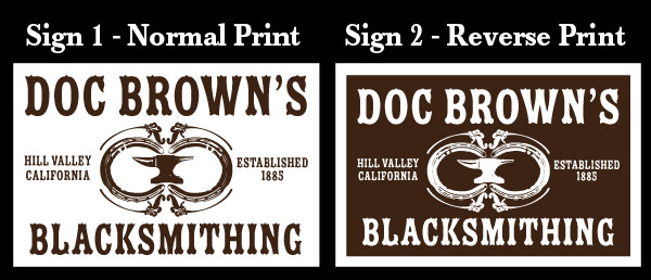
- Reverse Printing – Reverse printing is not mirroring the graphics. It’s defined as using ink to cover up more than 50% of the sign blank.
- Example: if the sign blank is white but you want white letters on a red background, than you want a reverse print sign.
- Flutes – are the way the corrugation runs in corrugated plastic products. You want vertical flutes if you are using most wire stands for small yard signs. You want horizontal flutes if your sign is 48×32 and up or if you won’t be using wire stands.
- Stock Colors – Colors that we have on hand all of the time that do not require a color matching fee. Our stock colors do not match directly to pantone colors, the values are approximate only.
Vector Artwork:
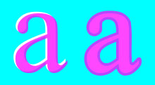
Vector graphics are the preferred printing format because they can be easily scaled up and down from any size (ex: stamp to billboard size) without losing any quality, this is called being “resolution independent”. This is possible because vector graphics are mathematical points that have instructions on how to display them on screen and in the printing process. These instructions can include path connections to make shapes, shape fill color, stroke width or color and other various effects. This makes vector files the most readily edit able. Colors can be separated and prepared for film positives and ultimately the silk screens / plates that transfer the ink to your signs. Typical file formats for Vector art are .ai, .eps, .pdf. (Do not rely on the file format as an indicator for vector format, each of those formats could also contain raster graphics)
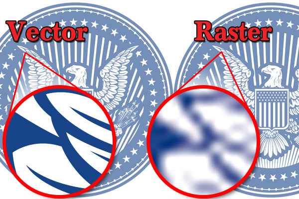
Vector graphics -vs- Raster graphics
Rasterized Artwork:
While vector graphics are “resolution independent” and are set to specific fill colors Rasterized artwork is the opposite. Raster graphics are made up of tiny pixels (dots) of different colors sitting next to each other to make up a bigger whole picture. This makes Rasterized / Full Color / Flat / Bitmap whatever you want to call it, dependent on the media that it is being viewed on. Web graphics are typically 72 dpi (dots per inch) since your computer screen doesn’t need more than that to display the graphic. Print graphics are usually a minimum of 300 dpi to print with high enough quality for your desktop printer or film positives for screen printing. Typical file formats are .jpg, .png, .gif, .tif, .psd.
The Bottom Line
In conclusion, the preferred type of file for the sign industry is a vector file. Vectors are easier to edit, manage and print at any size. If your design cannot be created in vector format for whatever reason make sure that it is designed in 300dpi resolution or above. Depending on what the graphic is we may be able to screen print it, convert it to vector or it may have to be printed on a digital wide format printer (sort of like a giant desktop printer).
————————————————————————————————-
De-Mystifying the print process: In a nut shell…
A common misconception for print industry outsiders is that printing is easy. We get a file from a client and hit print on the computer, right? But just like any job, if it really were that easy everyone would be doing it. There are a plethora of steps that go into making a sign and each of those steps have an abundance of things that could go wrong.
Finding out what the client needs
 Usually we get calls from clients telling us what they want, but the most important information to figure out is what they really need. We get a lot of calls that people want full color graphics and pictures and outlines with letters that have fades etc etc etc to be put on yard signs. While these are great ideas and the designs look awesome the return on investment is low. We will both put time and money into creating something that looks awesome but people that are driving by the sign at 30mph only have 2-3 seconds to get all of the information off of your signs. You are way better off making your sign simple with a design that has high contrasting colors and as little information as possible. Save yourself the time and money by putting the awesome, fancy designs on your websites and flyers when people are sitting down and paying direct attention to your message.
Getting the graphics ready to print
 The graphic designer or pre-press operator has an important job. Making sure that the files are up to the clients’ specifications, before printing, affects the rest of the process in a major way. If colors on the sign line up next to each other the colors must be overlapped to insure that the background of the sign doesn’t show through; this is called “trapping” colors. Trapping can be simple or extremely complex depending on the type of file and design. Vector files typically make trapping an easier job, thus again they are the preferred type of file. The amount of trapping needed depends on the type of printing and the material being printed on and the length of the run (quantity of signs). Screen printing on corrugated plastic requires larger trapped areas for many reasons; the screens have flex to them, the sign blanks aren’t typically square cut, the corrugation might not line up with the press “stops” perfectly, etc. Bag signs, which are printed on large rolls with plates, can have smaller trapping due to not having aforementioned problems. (However Flexo printing isn’t without its problems).
Printing film positives
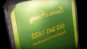
Each color of each design must have its own film positive. Film positives are used to burn the image of design onto silk screens; therefore the quality of the film positive affects the quality of the silk screens. The film positives must be as dark as possible in order to block the UV light from curing the emulsion on the screens. The darkness of the films can be affected by things as little as humidity, temperature, the quality of film and print head alignment / wear and tear.
Burning the images to the silk screens
 Problems here usually arise from physics. Is the ink on the film dense enough to block light from passing through to the emulsion on the screen? Is the film perfectly flat and lined up against the screen to get clean crisp transfer or will light wrap around the edges of the image? Is the emulsion properly applied in the correct thickness to promote good curation? Was the screen cleaned completely and correctly from the last image that was burned on it? Are the individual silk threads in the screen, the correct thickness and distance apart (mesh count) to reproduce the detail in the image correctly? How long do you expose the emulsion to UV light; too little, the emulsion doesn’t cure, too much, ink won’t pass through the screen correctly. Lots of elements to be considered here…
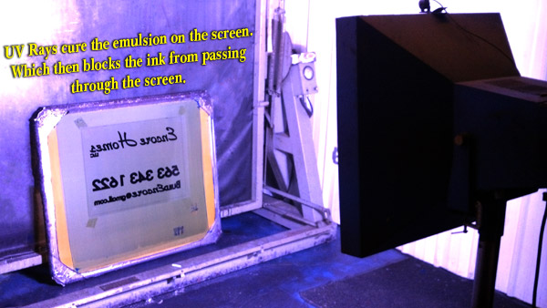
Printing the signs
Once the screen is mounted to the press and the individual ink colors are ready for print, each sign is printed. A press operator must make sure that each sign is lined up in the same spot as the last sign printed to insure good trapping on the next color. The PO must also make sure the quality of the print is up to standards; not only does the ink need to be applied evenly (requiring lots of adjustments) but the sign must run through a UV curation dryer to insure long lasting color quality. All of the problems from the previous steps compound here to make or break the final quality of the sign. Now the process is repeated for the second…third…fourth colors and so on.